Comicking Part 4: Pencils, Bubbles & Inks
- At March 27, 2011
- By Laur
- In blog, processes
 4
4
This is Part 4 of a series of posts I’m writing about how I made Final Track, a 34-page shojo manga I worked on as my submission for the Yen Press New Talent Search.
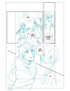
Using the thumbs I came up with, I started fleshing out my ideas on the computer using my Wacom tablet and Photoshop. I began drawing on the computer for this project because I knew I was going to ink by hand. Having digital files meant I could easily move panels around and make corrections faster than erasing and re-drawing line art. If it isn’t obvious by now, I take all the time-saving strategies I can get!
As before, I pay attention to the flow of the story and the dialogue and how a reader experiences the entire page. Sometimes, the squiggles in the thumbs process can’t really account well for bubble placement and I need to make a few tweaks. At this point, I’ve dropped the text into Photoshop from the script and create bubbles using the Pen Tool on another layer. I do this step digitally to make sure the text and bubbles work within the composition of the page. Nothing irks me more than pages with bubbles thrown in like a careless afterthought. These are important elements in comic pages and have to be treated with some dignity!
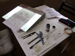
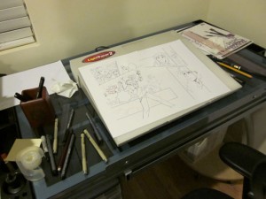
I had my first set of pencils reviewed then, made more changes and fleshed out backgrounds and details a bit more before printing it out for inking. Nowadays, I ink using my lightbox, an Artograph LightTracer Light Box. I have the 10×12 and this size suits me fine. Using a lightbox means I eliminate more pains associated with pencil erasure and torn paper.
I use both Copic Multiliners and Sakura Pigma Micron Pens
just because I’ve had them around for a while and I’d like to use them up. I’ve been experimenting a little w/ G-pens and Maru nibs but haven’t used them extensively for any project as of yet.
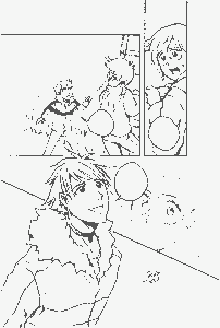
As for paper, I bought Borden Riley Paris 9 x 12 Bleedproof Paper at the suggestion of other webcomic artists. I like the thickness of the sheets and multiliner inks look great on it. I place a sheet right on top of my printed ‘pencils’, tape it down and ink borders, bubbles and the lineart directly. If there were any mistakes in my process, I’d say it was my reluctance to commit to stronger inks at this point. A lot of my inks felt weak so I had to redo them once they were scanned in.
Inking was probably the fastest part of the process because I was way too reluctant to put anything down. I do think the lineart could have used more contrasts in general. However, given that this was “shojo” I didn’t want to lose light and delicate lines that are quite characteristic in the genre either. Hopefully, it reads as somewhat in between the extremes.
Questions? Suggestions? I’d love to hear from you!
Previous Post: Comicking Part 3: Character Designs
Next Post: Comicking Part 5: Mangastudio and Etc.

